Integrating Halp, a help desk within Slack, into the Atlassian brand
Project Overview
In 2020, Atlassian acquired Halp to enhance its service request capabilities. The purpose of my project was to connect Halp to the Atlassian brand and facilitate user sign-ups and demo requests.
Role and Responsibilities
My task was to design three informative product pages that clearly communicate the product’s value, help potential buyers understand if Halp is a good fit, and make it easy for them to take the next step.
What is Halp?
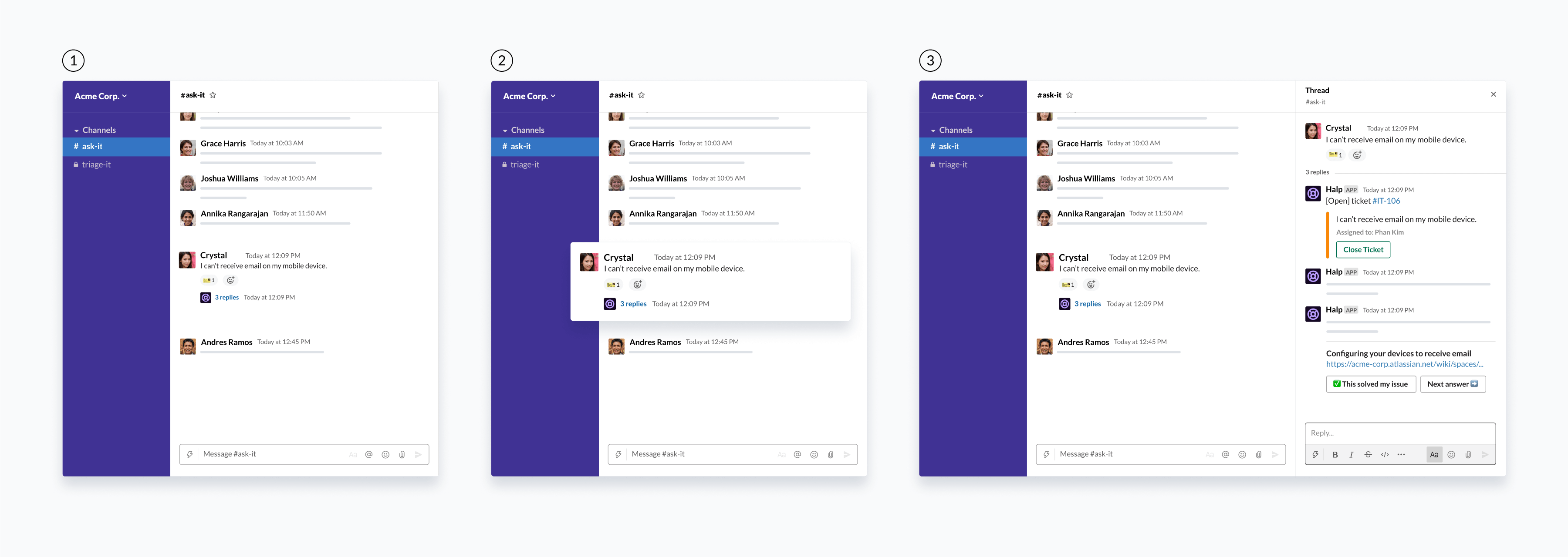
Halp transforms messaging platforms like Slack into internal help desks, enabling teams to manage requests and support tickets directly within their messaging platform. Here’s how Halp looks integrated into Slack:
- On the left side, the user is in the “ask-it” Slack channel, designated for users to submit requests.
- A team member sends a direct message to IT to request assistance within the channel.
- An emoji ticket is applied to indicate a support ticket has been created. The Halp Slack bot then sends a message displaying the ticket number, title, and assignee. Additionally, the bot reposts the original message as a comment.

User
The primary users are tech-savvy professionals from various departments, such as IT, Operations, Customer Success, and HR, who need versatile and flexible tools. Halp is utilized by mid-market and enterprise companies that require scalable solutions to manage large volumes of requests and users. Users heavily rely on Slack and Microsoft Teams for daily communication and task management. They have a strong preference for interfaces that integrate with existing communication tools, making interactions more intuitive. Additionally, they appreciate features that automate repetitive tasks and provide quick answers to common questions.
User Pain Points
Support teams often handle repetitive questions, resulting in inefficiencies and longer response times. IT teams manage multiple tools and platforms, disrupting their workflow and reducing efficiency. Additionally, high volumes of direct messages from users seeking help lead to cluttered and disorganized DMs, making it challenging to track and resolve issues efficiently.
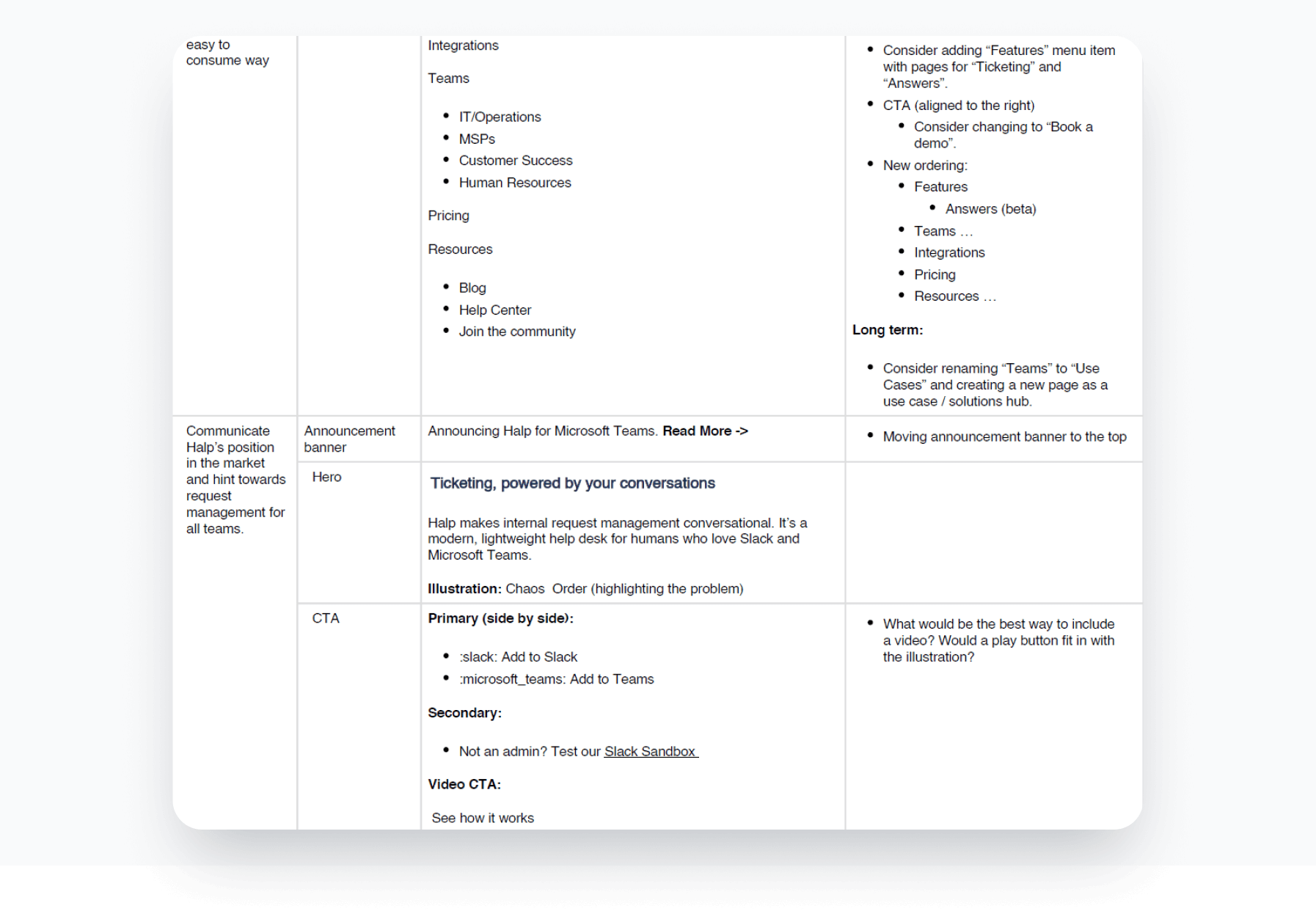
Review the Content Provided
I reviewed the provided content, including copy and necessary sections for the landing page, such as the hero section, feature highlights, and social proof. The documentation offered insights on visually organizing content to enhance readability and engagement.
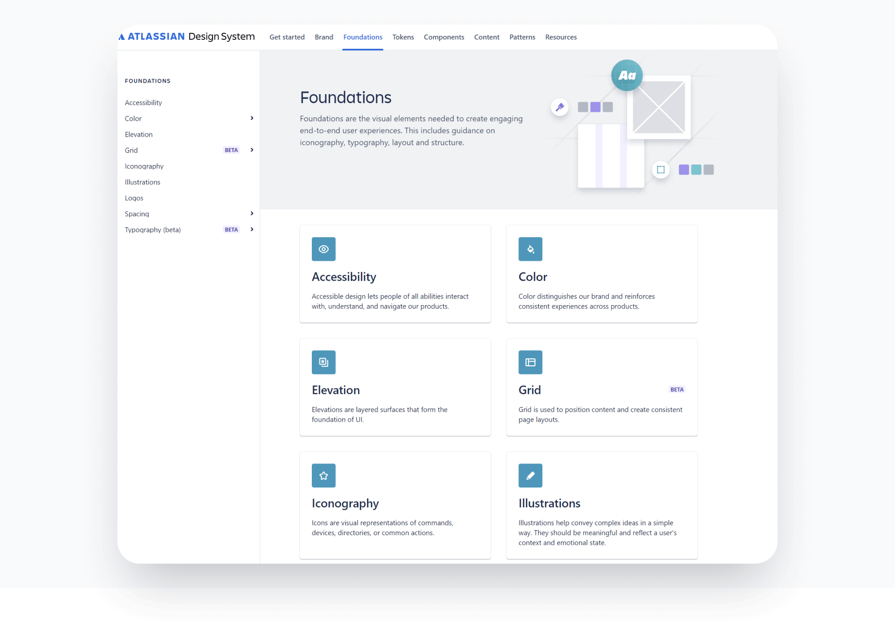
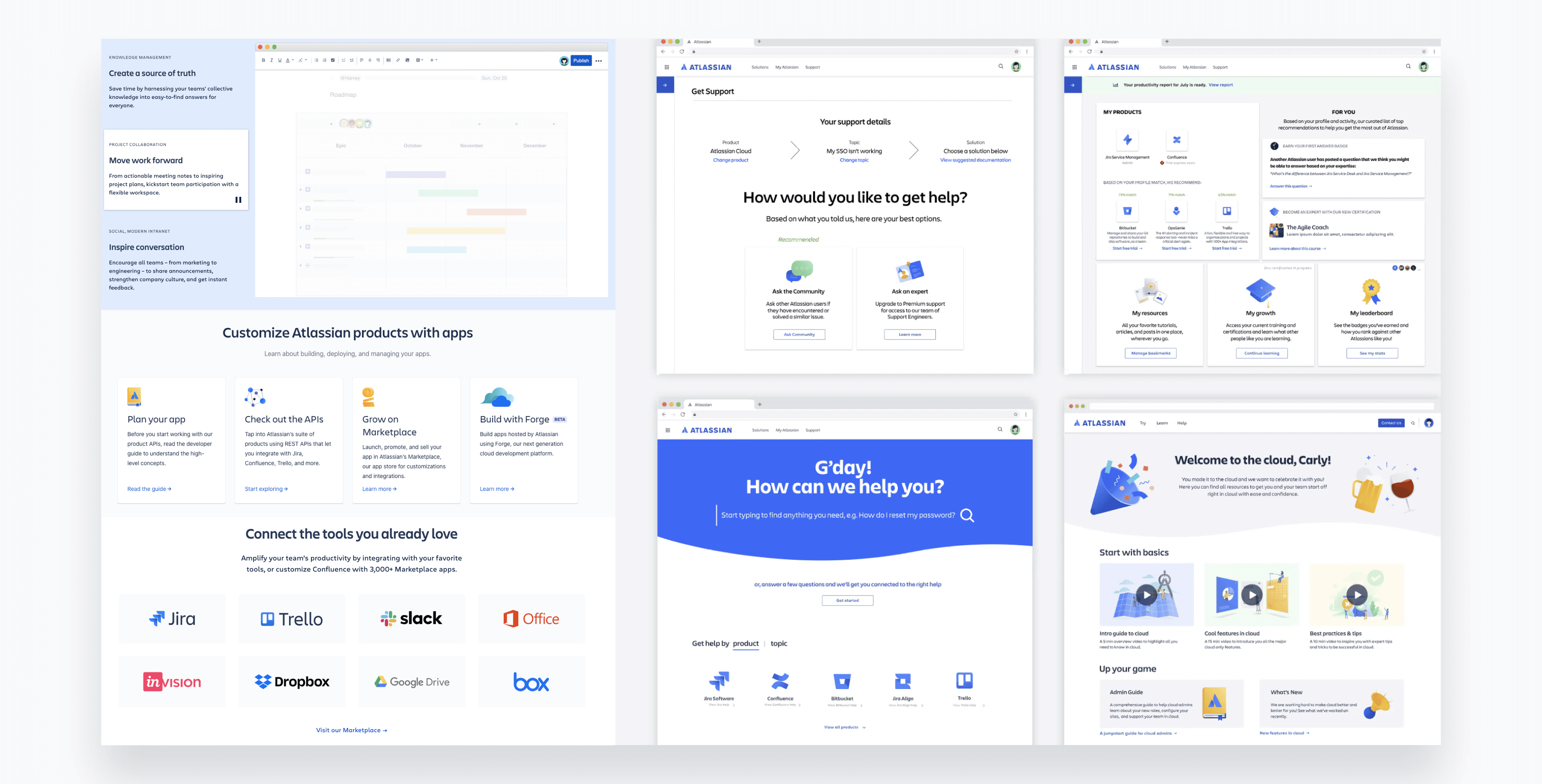
Analyze the Atlassian Visual Identity
I started the project by familiarizing myself with Atlassian’s design system, using their website as a reference to create visually consistent product pages. I collected screenshots to reference design patterns and ensure visual consistency.
Atlassian's visual identity features a clean, modern, and professional aesthetic, with secondary colors adding vibrancy and flexibility. The clear typographic hierarchy uses varying weights and sizes to distinguish headings, subheadings, and body text. Their unique style of illustrations is often abstract and geometric, adding a playful and creative touch. Generous use of whitespace ensures readability and an uncluttered layout.
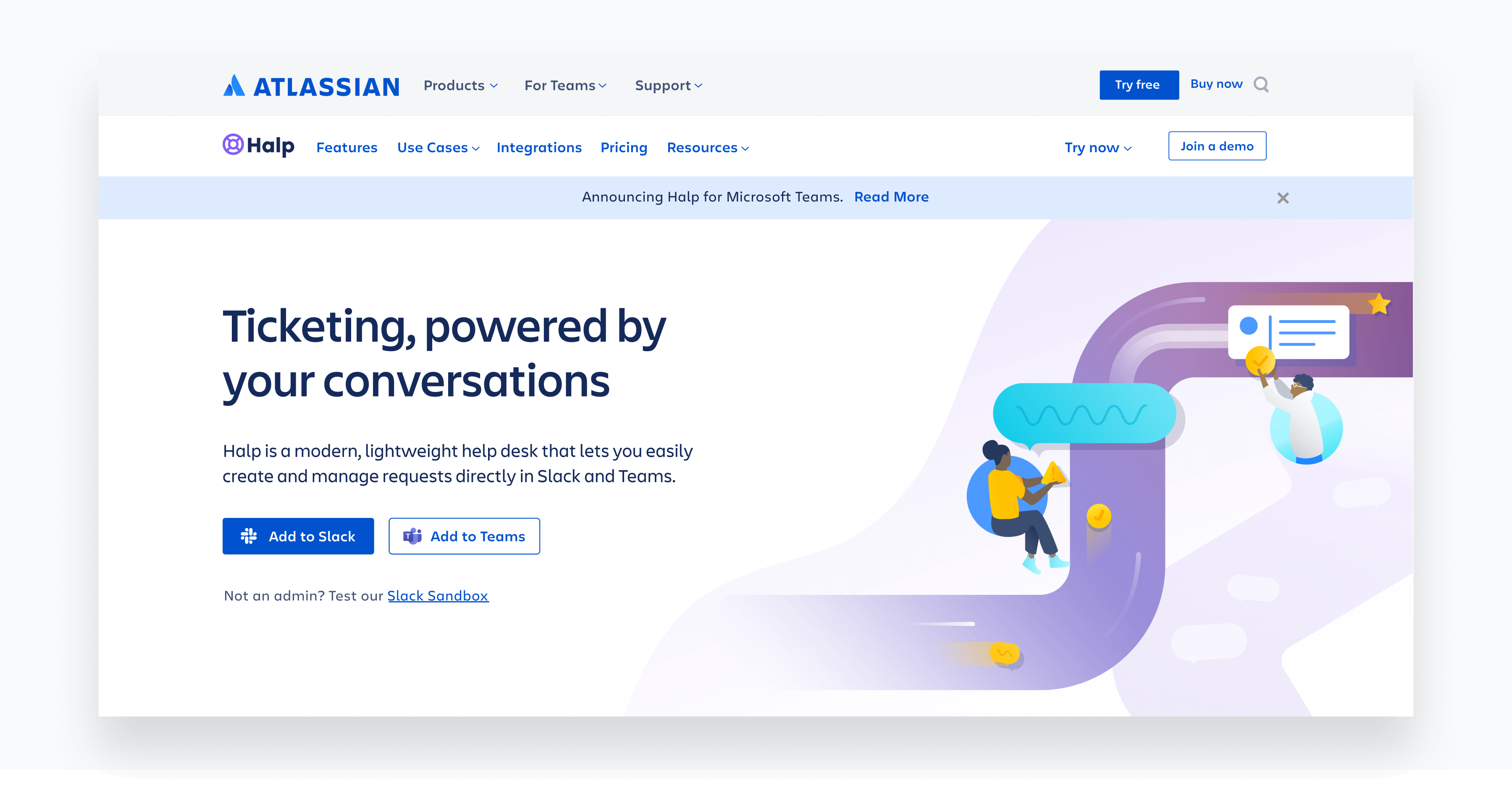
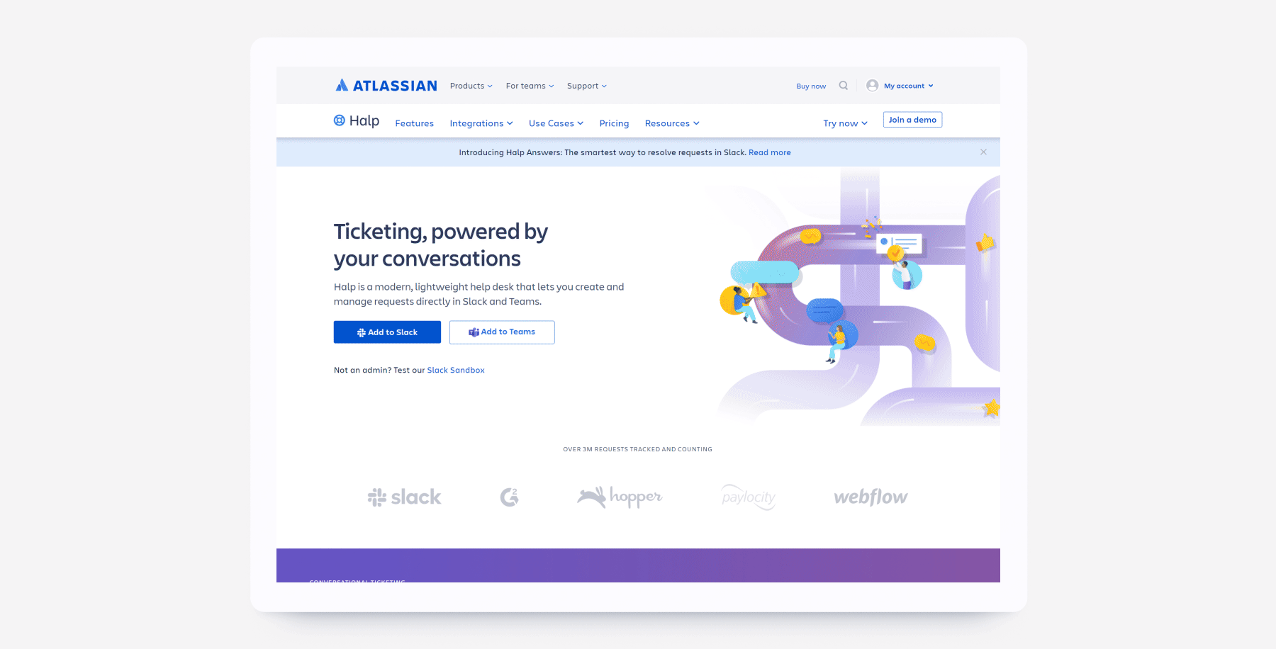
Hero
Following best practices for product page design, my goal was to clearly communicate the product's primary benefit and value to the prospect. I applied visual hierarchy to guide the prospect's eye to the most important information, starting with the headline that communicates Halp’s functionality and selling proposition. The call-to-action buttons are prominently placed and visually distinct, prioritized by importance. The provided illustration visualizes the process of managing requests and the transformation from chaos to order, enhancing understanding of the product.
The two-column layout, with text and CTAs on the left and the illustration on the right, adapts well to different screen sizes, maintaining usability and visual appeal across devices. Positioned above the headline and illustration, the Announcement Banner keeps users informed about the latest updates.

Features Section
The features section introduces conversational ticketing with visual aids enhancing the impact when prospects hover over individual content blocks:
First Block: Turning Slack messages into request tickets.
Second Block: Automating responses and empowering requestors to self-resolve common questions.
Third Block: Measuring the impact of individual agents and team efforts.
These interactive visual aids aim to enhance user engagement and comprehension by providing dynamic, contextually relevant information as users interact with the content blocks. This approach makes the information more engaging and memorable, significantly improving the overall user experience.

Looping Video Highlight
This section showcases the experience in Slack and MS Teams with a looping video that highlights using emojis to turn messages into tickets and managing requests within MS Teams. By creating an animated video, Halp can effectively communicate its value, making it clear how the platform simplifies and streamlines the process of handling support requests.

Social Proof
The goal of this section is to build trust and credibility by showcasing real-world customer use cases and recognizable logos of companies using Halp. Key design decisions include presenting multiple customer testimonials in an engaging and space-efficient manner, allowing users to navigate through different testimonials with arrow buttons. Each slide features a unique image and testimonial, providing visual variety and maintaining user interest.
The logos of reputable brands like GitHub, Pipedrive, and Strava signal to users that trusted companies use Halp. Using a monochrome design for the logos ensures they are visually cohesive and do not distract from the main content. A clean and uncluttered layout makes the content easy to read and visually appealing.
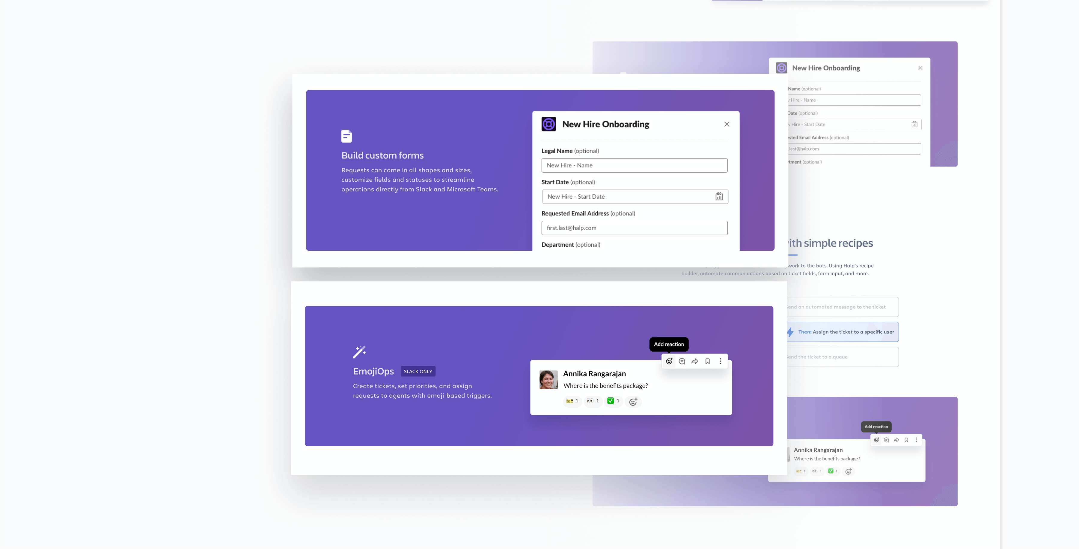
Key Feature Highlights
These two sections from the features product page effectively highlight key features of Halp while maintaining visual interest and readability. The use of background colors and an organized layout helps break up the content and guide the prospect through the page. The distinct background colors create visual sections that separate different features, making navigation easier and keeping users engaged with visual variety. Visual representations explain how each feature works, enhancing understanding and retention.
This design approach allows users to quickly scan the page and identify key features and their descriptions, improving overall readability and comprehension.
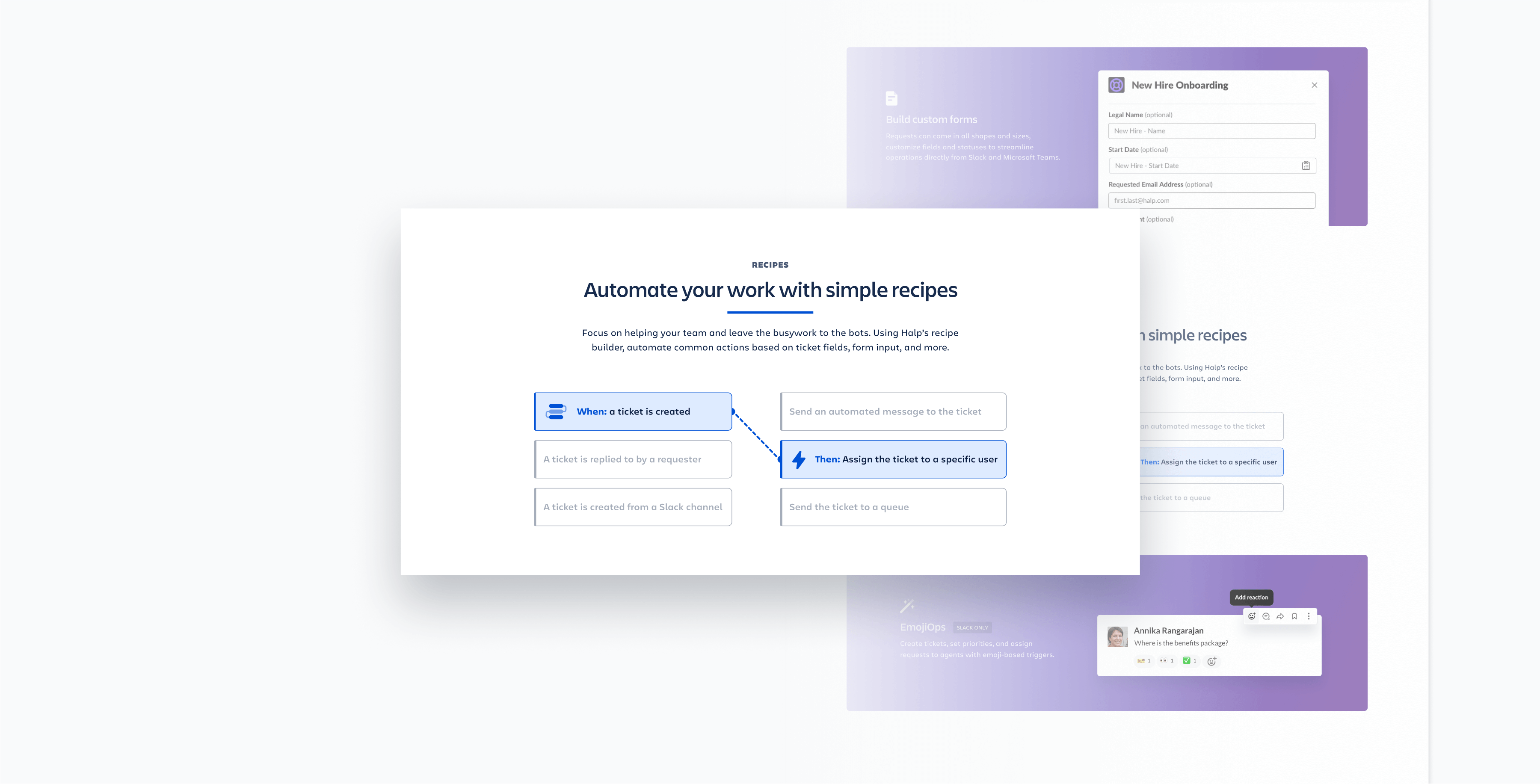
Key Feature Highlights: Diagrammatic Illustration
The goal of this section is to visually represent the functionality of Halp’s Recipe Builder in a clear and intuitive manner. The challenge was to convey how users can automate tasks using simple “recipes” through an easily understandable visual format. A flowchart diagram maps out the sequence of actions, illustrating the relationship between different steps. Each step in the Recipe Builder process is visually distinct, with clear labels like “When: a ticket is created” and “Then: Assign the ticket to a specific user.” Relevant icons next to the labels provide visual cues, reinforcing the textual information. This diagrammatic illustration style enhances clarity and understanding, effectively breaking down the automation process into simple, easy-to-follow steps.
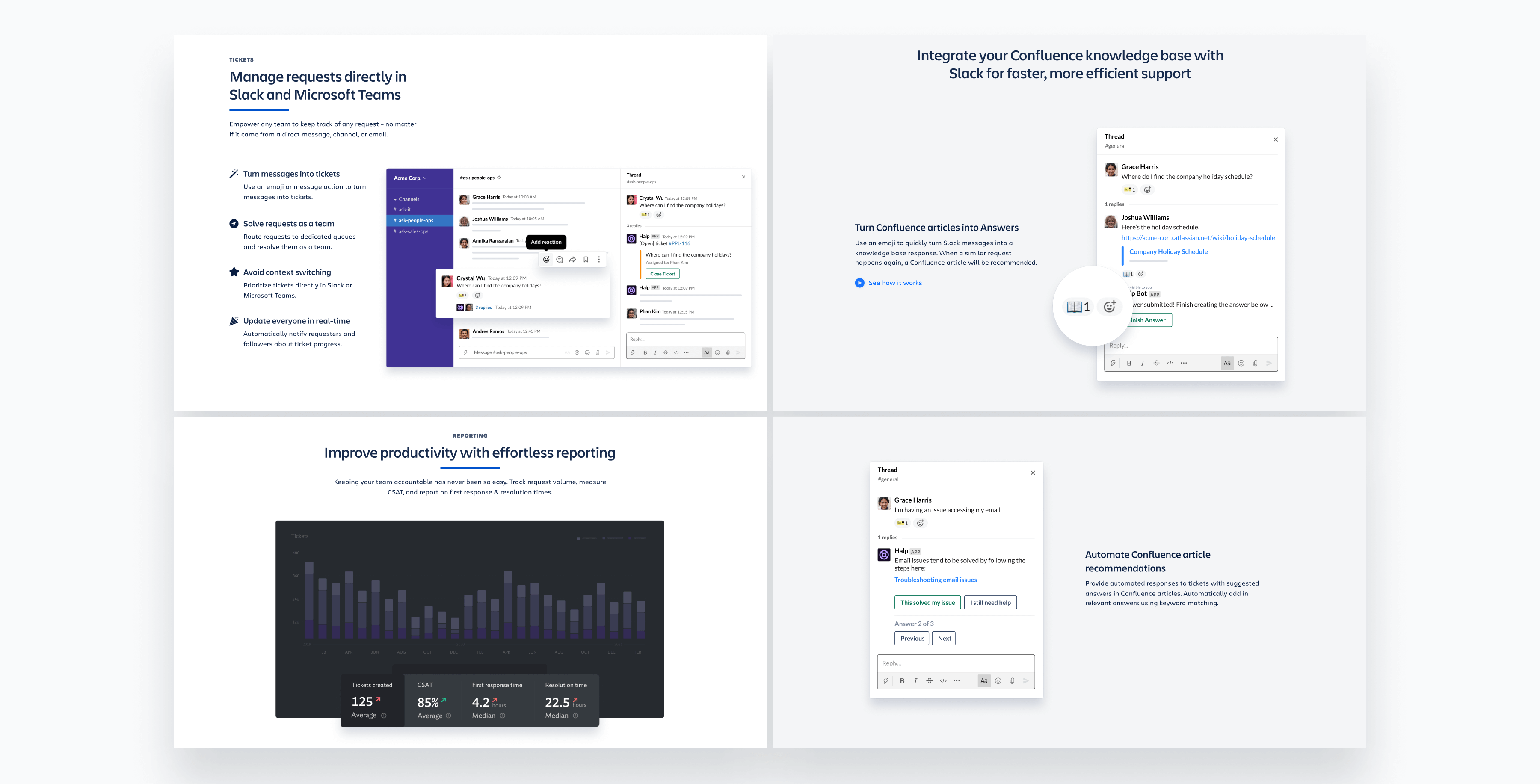
Throughout the product pages, my aim is to create depth and visual interest while effectively highlighting key parts of the user interface (UI). This approach enhances the user experience by drawing attention to important features and making the overall design more engaging and aesthetically pleasing.
To add depth and dimension to the flat screen, I used layered elements like screenshots, text boxes, and icons. These elements slightly overlap, creating a multi-dimensional effect that breaks the monotony of flat designs and adds visual interest. Key features within the UI screenshots are highlighted using magnification effects, directing the user’s attention to important functionalities.
Alternating layouts and varying the placement of text and images keep the design dynamic and prevent it from becoming repetitive. The use of contrasting colors and varying shades within the layers creates a visually appealing composition that stands out. Despite the added visual complexity, the design remains easy to read and navigate, ensuring a balance between aesthetic appeal and usability.
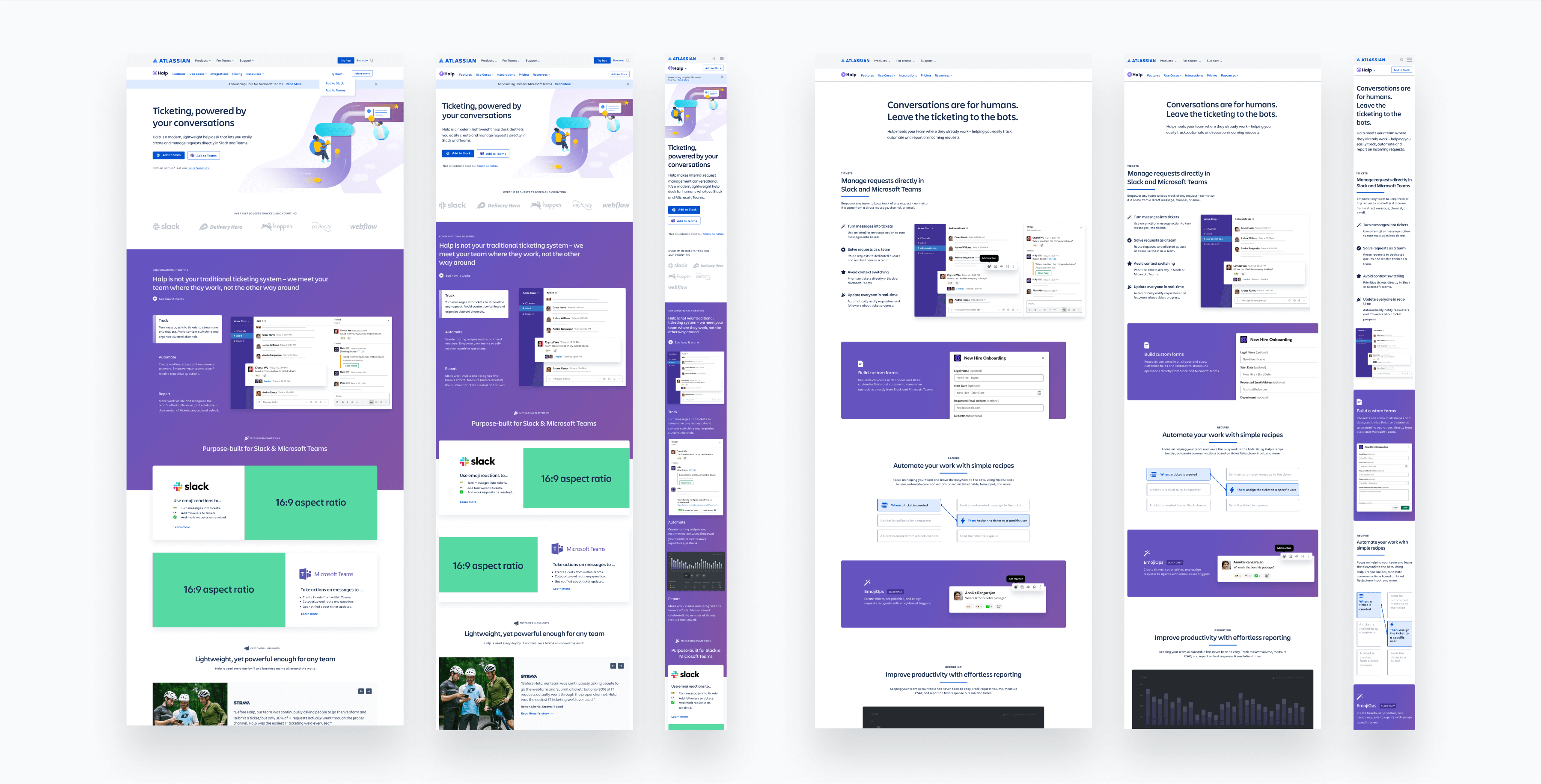
Responsive Design
To ensure an optimal user experience across all devices, I created responsive page layouts that fit different breakpoints. A responsive, fast-loading, and well-structured landing page enhances user satisfaction and retention. It also improves accessibility for users with disabilities by ensuring content is navigable with screen readers and other assistive technologies. Responsive design boosts search engine rankings as mobile-friendly websites are prioritized by search engines like Google. Maintaining a single responsive design is cost-effective and reduces maintenance efforts. A well-optimized design leads to higher user engagement, satisfaction, and conversion rates.
Conclusion
In conclusion, by deeply understanding user needs and behaviors and applying consistent visual themes, I designed pages that are both engaging and informative. My work on Halp’s product pages aimed to integrate the brand into Atlassian’s ecosystem. By leveraging Atlassian’s design system and maintaining visual consistency, I created product pages that effectively communicate Halp’s value proposition and facilitate user sign-ups and demo requests.